AURORA
Artisan tea brand identity, pouch design, and art direction for a premium retail launch.
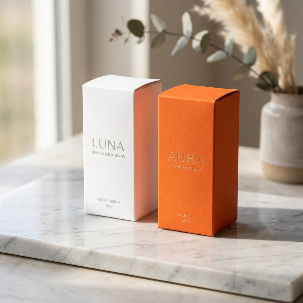

Challenges.
Aurora needed packaging that felt craft-forward yet shelf-ready, with a story that could stretch across DTC and wholesale without looking generic.
Solutions.
We defined a warm botanical palette, custom wordmark, and pouch system with clear flavor architecture. Photography direction and mockups unified social, web, and print touchpoints for a cohesive launch.
Results.
Aurora sold through its first retail pilot with packaging that testers ranked highest for clarity and shelf appeal.
3x
More Bookings92+
Team members2x
Conversion
"

Our socials used to feel scattered and inconsistent. Now, everything is on-brand, engaging, and performing better.
Mario Ramzan
CTO at NovaTech
MORE WORKS
ALL ↗
VIEW PROJECT
Bima
AI automation brand & web
VIEW PROJECT
Mandala
Website and branding for Design Agency